Brrr, it is chilly here, I am really grateful for our fire!
The last few days, I have been on a colour detox (sort of!). Not the kind of detox where you abstain from colour altogether, but the kind where you just let your imagination go, take inspiration from all kinds of places and try not to restrict yourself - just go with what feels and looks right to you in the moment rather than aiming for something specific. So maybe that's a colour retox then!
This all started I guess back in October. I bought a big batch of Stylecraft Special DK yarn in many bright colours and started playing. I then bought some more and because of the difficulties of ordering yarn when you can only see it online, ended up with lots of colours that I loved, but which didn't really work together. There then began a period of colour frustration where I could only use some of my lovely yarns together, whilst wanting to use all of them! I then moved into a stage of acceptance - I just worked with colours which I liked together, and accepted that the other lovely new colours I had would have to stay on the backburner for a bit. It was during the acceptance period that my colour therapy throw was born! (and yes, before you start to wonder, I am being facetious in my talk of colour therapy - I don't take it that seriously I promise!)
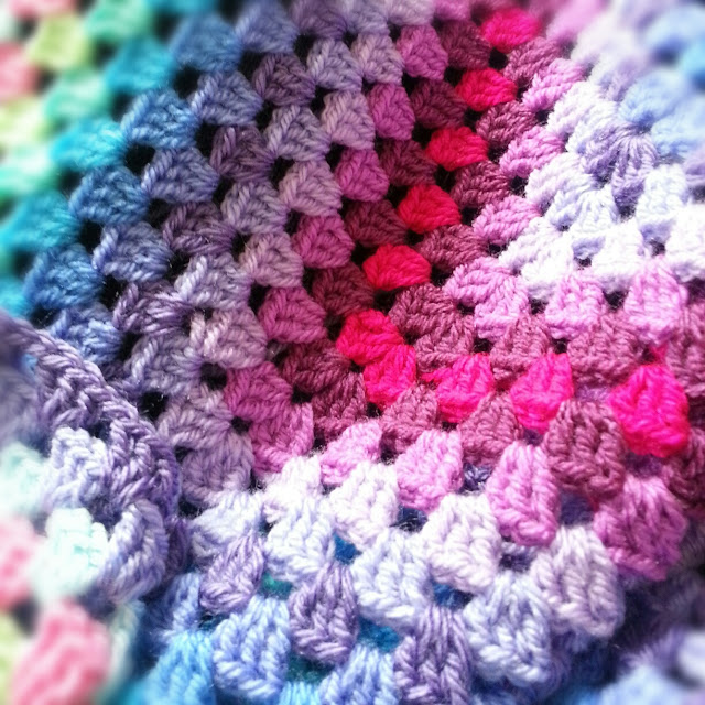
I'll tell you more about this throw when it's finished. I really want to talk about the project ideas currently on the backburner which have had time to develop as I worked on this throw. You can see the colours above are all quite bright, saturated hues - purples, pinks, blue, turqoise and green are all featured. The other colours which I felt didn't go with those used here were softer, more neutral colours. I had stashed away a biscuit colour, lovely old rose colour and some grape and plum shades.
Whilst I worked with my bright colours I had time to think about what I could do with these more muted shades, and the idea for a vintage, shabby chic, neutral colour palette throw slowly emerged. After a lot of browsing around on Pinterest for inspiration (you can see the colour inspiration board I have been building here), I began to realise that I had colour palettes for not one, but possible 2 throws in mind. One with old rose, blush pink, biscuit and cream tones, and one with lavender, lilac, grey and off white tones. My working title for these is 'vintage pastel throw' at the moment. Today I took the plunge and ordered yarn in shades that I think will work. I can't wait for the delivery to arrive!
Looking on Pinterest and working with the bright colours I already have also reminded me how much I like frosted candy coloured shades together too - you can see some of this appearing in the colour therapy throw above - I'm talking about sugar pink, baby blue, violet and peppermint which you can see on the outer rounds in the picture above.
Watch this space - more on the plans for my vintage pastel throw soon!


It's beautiful! What yarn are you using?
ReplyDeleteEsther.
Thanks! The yarn is Statecraft Special dk in lots of colours- plum, fondant, lavender, wisteria, turquoise, bright green and pale blue.
DeleteOops I meant Stylecraft special dk!
Delete